
NASA Small Spacecraft Systems Web App Redesign
I led the design of a 6-tool, 54 screen NASA research platform while teaching my team what product design was along the way. Satellite engineers faced 2 main issues: tool fragmentation and scattered information. The core features of the platform lived in separate, inconsistently-designed systems. Some were abandoned mid-build, some copy-pasted from generic templates, and nothing in the legacy app was built with input from a designer.
Through an honors course at SJSU I partnered with the NASA Ames Research Center as the sole designer on a 4 person team. My teammates had no prior product design experience. We faced challenges including unclear stakeholder communication and a month long federal government shutdown which took away access to both our stakeholder and all of our code and source files.
Throughout 8 months, I redesigned the platform end-to-end: a spacecraft configurator, a testing facility matcher, 2 data visualization tools, and finally created an AI chatbot to help less experienced users navigate the highly technical satellite design process by providing any context needed.
My Role
UX Designer, Researcher & Project Team Lead
Worked with: 2 engineers, 1 PM
Timeline
August 2025 - May 2026
My Tasks
Product Design
Design System
XFN collaboration
Prototyping & development
User Research
Tools
Figma,
Figma MCP
Codex
Claude Code
Adobe Illustrator
My Contributions
I Led the Vision For a New, Unified, User Friendly Satellite Engineering Platform
1
Design
I owned end-to-end redesign across 6 interactive spacecraft design tools, created a unified design system, and integrated an AI-assisted chatbot to improve platform accessibility.
2
Advocacy
I ran several hands-on UX workshops to build shared design literacy including during a period when our usual project files were inaccessible. I showed my team why good design matters.
3
Resilience
Through a month-long government shutdown that cut off stakeholder and source-file access, I used Codex, Claude, and Figma MCP to prototype and test ideas without the code or stakeholder access.
Context
What Exactly Am I Redesigning? Why?
The Small Spacecraft Technologies State-of-the-Art (SOA) Web Application is an online extension of the Small Spacecraft Technologies State-of-the-Art Report, a document to help engineers, researchers, and students design and validate small satellites using real, documented spacecraft components. This report is published by the Small Spacecraft Systems Virtual Institute (S3VI) at NASA Ames Research Center annually.
The web platform meant to bring that report to life had never been treated as an actual product. It was built in pieces, by different teams, at different times, with no design oversight — some tools shipped as functional prototypes, others left as unfinished demos on a leftover template that didn't even connect to our main codebase.
The Core Problem
The Platform Was Too Fragmented to Trust, and Too Complicated to Use.
Component data, facility matching, and spacecraft configuration each lived in different sections that didn't share a visual language, a navigation pattern, or even basic safety nets. Users could lose an entire multi-step configuration with one misclick and no warning. On top of that, every interactive tool assumed a user background in aerospace. NASA wanted the platform usable by "novice and advanced users" alike. My team pushed that further, aiming for a tool that worked for a user with no engineering experience and a seasoned aerospace engineer without compromising the experience for either one.
How Might We Redesign the NASA S3VI Web App to Optimize User Experience and Lower the Barrier to Entry for Small Spacecraft Design?
User Research & Discovery
What Did NASA Engineers Really Want?
My team had 0 experience with small satellites or aerospace products. In order to gauge current sentiment on the web app outside of just the design of it, I got creative and asked my project sponsor to coordinate live product walkthroughs and interviews with other 13 NASA officials and engineers on my behalf. I discovered:
The small spacecraft design tool is the marquee feature of the web app, a first of its kind tool that allows engineers to digitally test various satellite builds with components that NASA already has access to, theoretically cutting blueprint-to-launch time dramatically.
The report has 476 pages. The platform needs to be able to condense that content and allow users to make decisions with the data as quickly as possible, so multiple ways to compare information were necessary.
Currently, the platform's code was working but the UX for both engineer and novice was flat out not enjoyable.
Design System Constraint
Interviews with external engineers who maintained the platform's backend resulted in the Material UI being chosen as the component library for implementation. MUI being a React library made it the preferred choice for our developers.
With a 2-engineer team and no dedicated frontend headcount to spare from NASA, Material UI's pre-built components saved me time creating a unified design system for the SOA app.
Legacy Platform Audit
With better grounding in the goals of the project and its users, I conducted a tool-by-tool audit of the existing web app. (Screenshots below are only part of the full audit, there were around 30 different total screens).
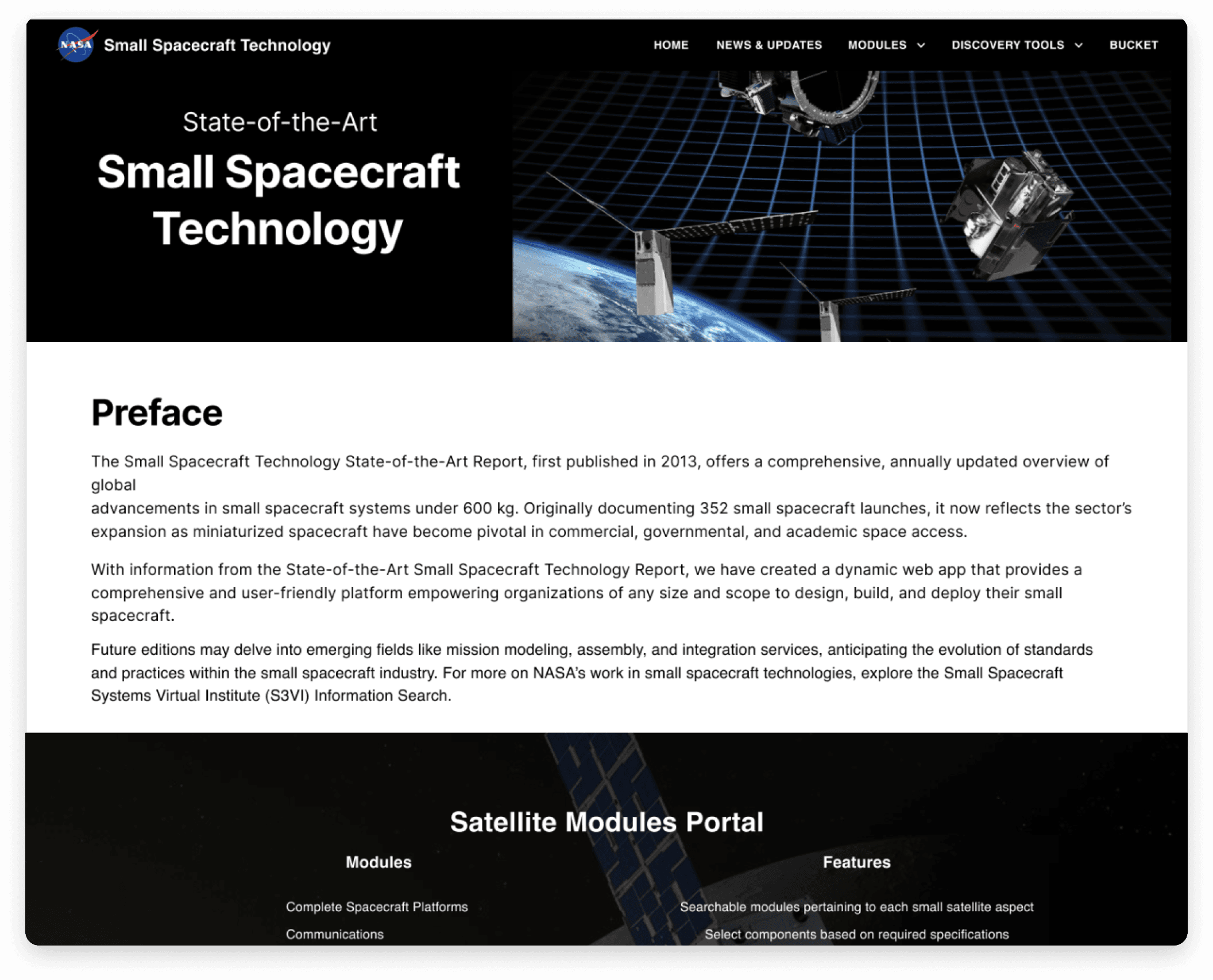
Landing Page
+
The nav bar split the interactive tools into two different sections that correspond to their intended usage.
-
Lack of any entry points to interactive tools, mostly marketing / intro copy.
-
The Design Tool, the web apps premier product, is not featured at all. The only way to access it is from the nav bar.

Subsystems Explorer (Individual SmallSat Component Data Tables)
-
Filtering system built entirely from individual text entry boxes, making filtration bloated and as slow as simply scrolling.
-
No way to show or hide columns as needed, certain components have over 20 unique columns of data.
-
Raw, unformatted cell data and column headers that wrap across 4+ lines hamper legibility.

Small Spacecraft Design Tool (Automated Version)
-
29 text entry fields as part of one form increases cognitive load and overwhelms the user.
-
No grouping of different elements, unrelated categories all sit next to each other.
-
The CLEAR button (destructive action) is placed where the complete button usually is in traditional forms guiding the user to undo their progress rather than submit it.
Primary Design Goal
Empower the User
My project sponsor wants the web app to make small spacecraft design and validation both accessible and effective to anyone from a first-time student to a seasoned aerospace engineer.
The legacy platform was inaccessible to novice users and the design fought the user. My goal was to transform the platform by creating a design system, restructuring information dense tools, and most significantly, using AI to make the technical content digestible.
My Redesign Solutions
Danial's Course Correction

Form Design
The legacy Small Spacecraft Design Tool packed 29 text entry fields into a long, single page form.
I incorporated progressive disclosure – dividing information across multiple screens by category, creating a 10 step form with a progress bar so users always know where they stand.
This design was repeated for other form based tools like the Testing Facility Finder and Manual Spacecraft Design Process.

The SOA Mission Assistant
The SOA Mission Assistant is how I made dense technical accessible to all users. Trained on NASA's own Small Spacecraft Report data, it explains complex terminology in plain language, whenever a user needs it.
Chatbot Design
In addition to simplifying complex small satellite content, the SOA Mission Assistant adapts to context.
Suggested questions change depending on which screen a user is on, so recommended prompts on the landing page differ from the prompts mid-configuration in the Design Tool or when viewing components in the Subsystem Explorer.
A floating action button was chosen as the entry point to ensure it was accessible at any point on the platform.

Component Metric Analyzer (Graphical Analysis Tool)
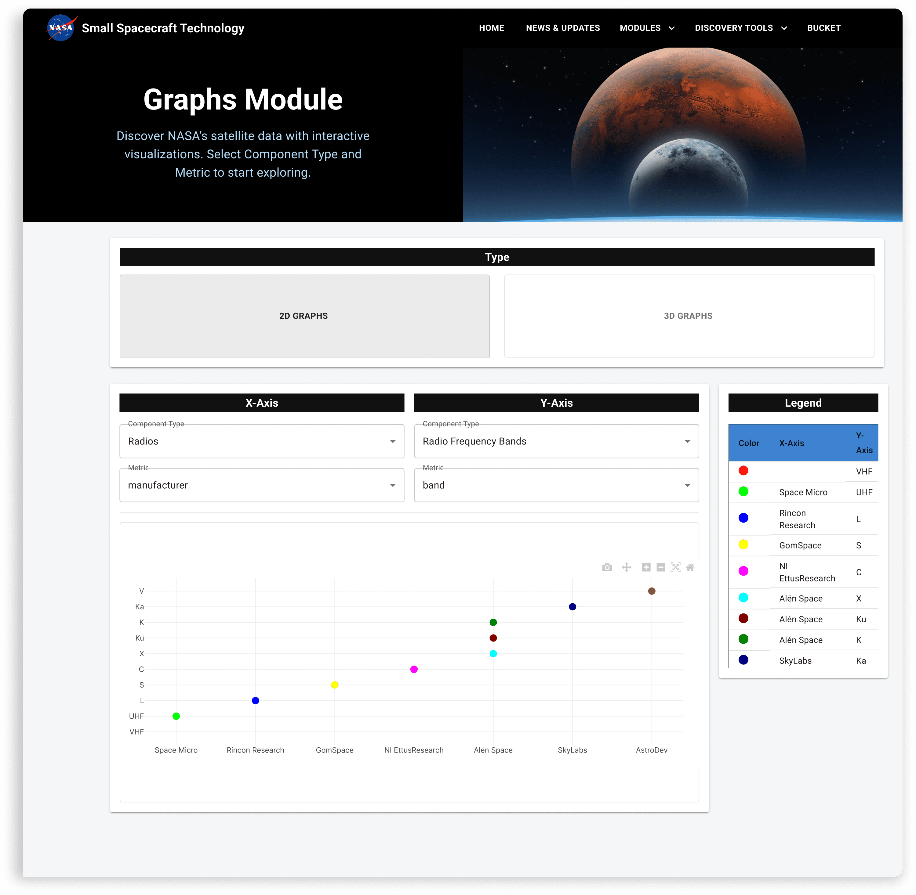
Before
-
No restriction on what the user could compare, charts with no real analytical value could be easily produced.
-
The graphical had the X and Y axes cropped off with various comparisons, making results harder to understand. The legend was detached from the graph.
-
The hero section and large graph dimension buttons competed for a user's attention before the primary action.

After
+
Introduced chips to separate spacecraft subsystems by category, ensuring the creation of meaningful graphical outputs.
+
Added a toggle to compare either two metrics within one component or the same metric across two different components, preventing valueless pairings.
+
Code reconfiguring ensured the legend was a part of the graph and there was no axis cropping.
Subsystems Explorer (Component Data Tables)
Revamped Searching and Filtering
+
Replaced 12+ free-text 'Filter by...' boxes with a functional search and structured, removable, stackable filters.
Column Visibility
+
Implemented column visibility and ascending/descending sorting controls for individual columns.
Testing Facility Finder (Matcher Tool)

Before
-
Results table regurgitates every input field the user filled out as its own column
-
No hierarchy for the matching facilities

After
+
Completing the form displays a dedicated results screen with search and filtering
+
A match strength ranking is introduced next to each facility and color coded for easier scanning
Did It Work?
User Testing Outcomes
The process of creating the SOA Web App was always a collaborative one. Throughout various iterations of the web app, I worked with my project sponsor to arrange walkthroughs and I led user testing with 13 NASA officials, designers, developers, and small spacecraft engineers. Their feedback shaped the designs throughout. Here are some notable results from user testing of the final iteration:
Universal Chatbot Adoption
Every participant opened the chatbot at least once while using each tool. Seasoned spacecraft engineers rarely relied on it, novice users relied on it for nearly every step.
Less Experienced Users Spent Nearly 6x Longer Per Form
Most of this increased time was caused by chatbot lookups on unfamiliar terminology before proceeding to the next field. The chatbot allowed novice users to successfully use the tools, but near constant questioning occurs throughout.
Time-on-Task and Completion Rose After Pagination
Segmenting the single-page legacy form into steps increased overall time-on-task compared to before. Interviews found this to be more deliberate engagement per step, especially with additional context coming from the chatbot.
Overall, users expressed verbal satisfaction with the platform. Pagination and the chatbot were the consensus favorite features, users stated they enjoyed the feeling of the content being far more digestible than before my redesign.
Challenges
Staying Resilient
Stakeholder Alignment
Communication with our project sponsor was sporadic, and he didn't have a clear idea of what he wanted the end product to look or feel like. I navigated that ambiguity by working directly with him to coordinate interviews and walkthroughs with 13 NASA officials and other interns on the project. Establishing direction and aligning stakeholders early was critical to cutting through that uncertainty.
The Government Shutdown
The longest federal govt. shutdown in US history from Oct. 1 - Nov. 12, 2025 removed our stakeholder, code, and NASA access with no warning or return date. To keep the team moving, I taight design concepts to my engineers and mapped how those designs would integrate into the frontend code I'd saved beforehand, so we hit the ground running the moment access returned.
UX Advocacy
None of my teammates or stakeholders had prior product design experience, and as a group, we had zero background in small satellite engineering. Advocacy couldn't be separate from the design work, it had to be the design work. I ran hands-on workshops to build shared design literacy, so decisions could be discussed on common ground. Explaining why a change helped the user, not just what changed, went a long way toward earning the team's buy-in.
Reflection and Learnings
1
Showing Work Early and Often
Alignment decays between check-ins. Sharing progress all throughout the project lifecycle, rather than at the end of an iteration, kept leadership, PM, and engineering in the loop and bought in the whole way through, especially important for a team that did not see the value of design at first.
2
Tradeoffs
Splitting the legacy forms into multiple steps traded raw speed and a lower screen count for deliberate engagement. Time-on-task went up, but so did comprehension. Building and training the chatbot was a late, unplanned feature and we had to sprint to the finish line but it was incredibly important for bridging the accessibility gap and ensuring wider platform adoption.
3
Prioritization
Being the lead designer meant I was responsible for a lot. 6 interactive tools, a whole new visual language, a crucial accessibility overhaul, design advocacy, and user testing all at once. This heavy workload taught me the value of strict prioritization. I focused my effort only on features that delivered the highest, most valuable impact for our users first.
Sponsor Feedback
POV: Working with Danial

Deputy Director : Small Spacecraft Systems Virtual Institute
NASA Ames Research Center
Craig Burkhard
“Danial did a fantastic job redesigning our interactive platform. He showed great leadership guiding the team through the government shutdown. When the team experienced unexpected challenges, they always found solutions to overcome those challenges. The design tool will have a significant impact on how small spacecraft will be designed in the future. The UI/UX modifications by Danial will allow for a significantly more positive experience for the user. I would love to work with him again in the future.”